Tweet
November 6, 2014
Proceedings of the Natural Institute of Science | Volume 1 | HARD 7
We are entering an unprecedented age in baby name flux
Department of American Nomenclature1 and Division of Legal Compliance1
1 - PNIS

Introduction
Federal law requires that, within the first year of their establishment, new publications must publish an article utilizing the United States Social Security database on baby names[1]. As a result of this law, articles on baby names have been published in: online blogs [e.g., Prooffreader (link, link, link, link), FlowingData (link, link, link), FiveThirtyEight, Jezebel, Waitbutwhy, nymag, and Fulcrum. Then, there’s Freakonomics and babynamewizard which have more baby name articles than there are baby names], academic journals (e.g., Proceedings of the National Academy of Sciences; Proceedings of the Royal Society B; Proceedings of the 2012 Conference of the North American Chapter of the Association for Computational Linguistics: Human Language Technologies; Proceedings of the 3rd Workshop on Computational Linguistics for Literature; Proceedings of the 5th WSEAS International Conference on Artificial Intelligence, Knowledge Engineering and Data Bases; Proceedings of the 13th ACM International Conference on Modeling, Analysis, and Simulation of Wireless and Mobile Systems; Proceedings of the 16th ACM International Conference on Multimedia; and Academy of Management, Proceedings), and an academic journal that seems to have originated as a result of this database[2]. Therefore, in accordance with US Statute 72-4224[3], PNIS is proud to present our analysis of baby names in the United States.
What exactly have all these previous studies uncovered about our denomination of offspring? Well, we’ve found out that the popularity of top-ranked names has decreased (Prooffreader, FlowingData, Twenge et al. 2010), boys names that end in ‘n’ are on the rise (Proofreader), “Jennifer” used to be popular (Jezebel), girls names are more varied than boys names (Li 2012), popular names are less common on frontiers (Varnum and Kitayama 2011), and that you can’t attend a data visualization or computing conference without running into this dataset.
In choosing our particular research topic, we wanted something unique that no one else had ever studied, or, at the very least, was popular many years ago but has since decreased in popularity. Mostly, this desire stems from the eminent publishability and coolness of novel research papers. Plus, many famous people are choosing really unique research topics and we kind of want to be just like them. Deep inside, though, we’re hopeful that the research topic we pick will start a new hip trend.
We’ve observed that prospective parents are choosing names solely on their uniqueness[4], which, in our humble opinion, is not the best reason for a name. In the past, inspiration for names has come from politicians, relatives, and stars of the cinema, while current inspiration originates from compass directions, various fruits, or popular tourist destinations. The desire to pay homage to a respected and renowned person has been replaced by the desire to be unique, a most disturbing trend. Thus, we’ve decided to analyze the Social Security (SS) database to see how four different metrics have changed over time: 1) number of unique names, 2) the diversity of names, 3) the evenness of names, and 4) flux, the year-to-year change in name popularity.
Methods
The Social Security Administration of the United States of America has a database containing the frequency of first names of US citizens from 1880 to present (we downloaded the dataset that contains data until 2012). There are several things to note about this dataset:
1. SS in the US didn’t start issuing cards until 1937[5], so the data from 1880 to 1937 represents older people (i.e., not newborn) that signed up for SS (probably for employment). So, for example, an entry of 500 Irene’s in 1900 in the dataset doesn’t mean that 500 baby girls were named Irene in 1900, but that 500 Irene’s born in 1900 signed up for SS in 1937. In other words, the data before 1937 is a bit dubious.
2. Even for some time after 1937, it’s debatable that everyone registered their newborns with the government.
3. Gender designations can be a bit wonky at times (see Prooffreader).
4. For privacy reasons, the database only gives names with at least 5 entries.
5. The database also includes entries such as “Unknown”, “Baby”, or “Infant”, which are too sad to warrant further comment.
The dataset for any particular year is just a list with three columns: Name, Gender (M or F), and Number (corresponding to the number of people having that first name). We first separated the dataset by gender, and then calculated the proportion of each specific name (for instance, in 2012, the proportion of newborn girls named Sophia was 0.0127, or 1.27%). Using this proportion we were able to calculate:
1. Diversity. Diversity could just be the number of unique baby names. But, when you have information on the abundance of each name, you can calculate diversity indices, which consider the frequency of each type (i.e., for us, a “type” is any particular name). A high diversity index value indicates that the names are evenly spread out (i.e., one name doesn’t dominate over all the others). We used the Shannon Index (abbreviated as H’), which is calculated as: -∑ piln(pi), where pi is the proportion of the population given a particular name (so, in 2012, pSOPHIA = 0.0127).
2. Evenness. This is related to diversity, but is perhaps a bit easier to comprehend because it can only take a value between 0 and 1 and is often thus expressed as a percentage (e.g., a value of 0.75 means that baby names for that particular year were 75% even). Higher numbers indicate names are more spread out, while lower numbers indicate that several names are more dominant. We calculated evenness (abbreviated as J’) as: H’/H’MAX, where H’MAX is the natural log of the total number of unique names in that year (so, as you can see, evenness also takes into account the number of baby names per year).
3. Flux. This one’s easy: take the proportion of any name in one year, subtract from it the proportion of that name in the very next year, and obtain the absolute value (in other words, don’t have any negative numbers). Then just add up all the values for all names to get an overall measure of how much every name changed from the previous year. Large values indicate a lot of change from the previous year.
We calculated these three metrics (and some others self-explanatory ones like number of unique names) for each gender and each year, and then made some cool graphs[6].
Results
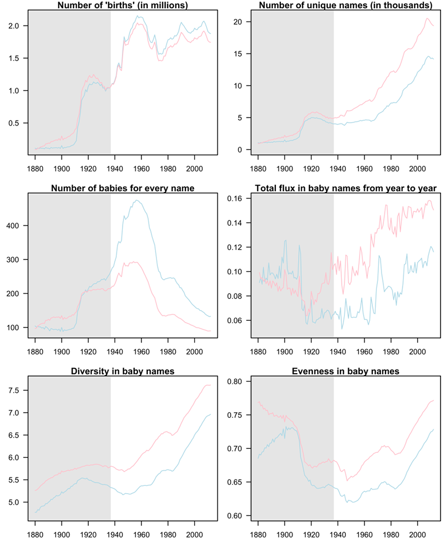
We made six cool graphs, which we’ll call Figure 1 (note the shading from 1880 to 1937 to reiterate the dubiousness of that data).
Here are some trends that we saw:
Gender: 1) girls consistently have more unique names than boys (top right panel), 2) girls names are more spread out than boys names, or, in other words, more boys share names than do girls (mid left and both bottom panels), 3) girls names consistently go through more year-to-year change than boys (mid right panel).
Historical: 1) the number of unique names has gone up nearly 4-fold (girls) or 3-fold (boys) since the 1930’s (top right panel), 2) names of both genders have gotten more spread out, or, in other words, less names have been dominant over time (mid left and both bottom panels), 3) flux in baby names has steadily increased since the 1930’s (mid right panel)
We also put together a table of the names with the biggest gains and losses in proportion for every year and gender (see Appendix, only available in pdf version). Mostly this table exists so we can marvel about the silly names of the past and see if our parents were hip to the then-current naming trends.
Discussion
Well, first we supported what just about everyone else has found out with this dataset: namely that the distribution of baby names has evened out over the years. In other words, the top-ranked names are losing popularity. In other, other words, fewer babies are being called the same name; there’s much more diversity out there. This trend has been recognized by researchers publishing in both academic journals (e.g., Twenge et al. 2010, Li 2012) and blogs (e.g., FlowingData[7], Fulcrum, Prooffreader). Interestingly, different calculation methods have been used to arrive at the same conclusion: for example, Li (2012) used the Gini index, which is typically used to measure wealth distribution, and Fulcrum used the Herfindahl-Hirschman Index, which is typically used to measure how concentrated a market is (i.e., is there perfect competition or is it a complete monopoly?). We used Shannon’s Diversity and Evenness, which are typically used to assess species diversity in different habitats.
So, what’s behind this trend? Fulcrum identifies three different possibilities: 1) increased immigration, especially from areas that have little first name overlap with the US, 2) a desire for uniqueness, and 3) the fact that older names die hard (for example, there were still 28 girls named Bertha in 2012). Twenge et al. (2010) also point out increased individualism as a driver of this trend, but question immigration as an important factor, as their models controlled for immigration rate.
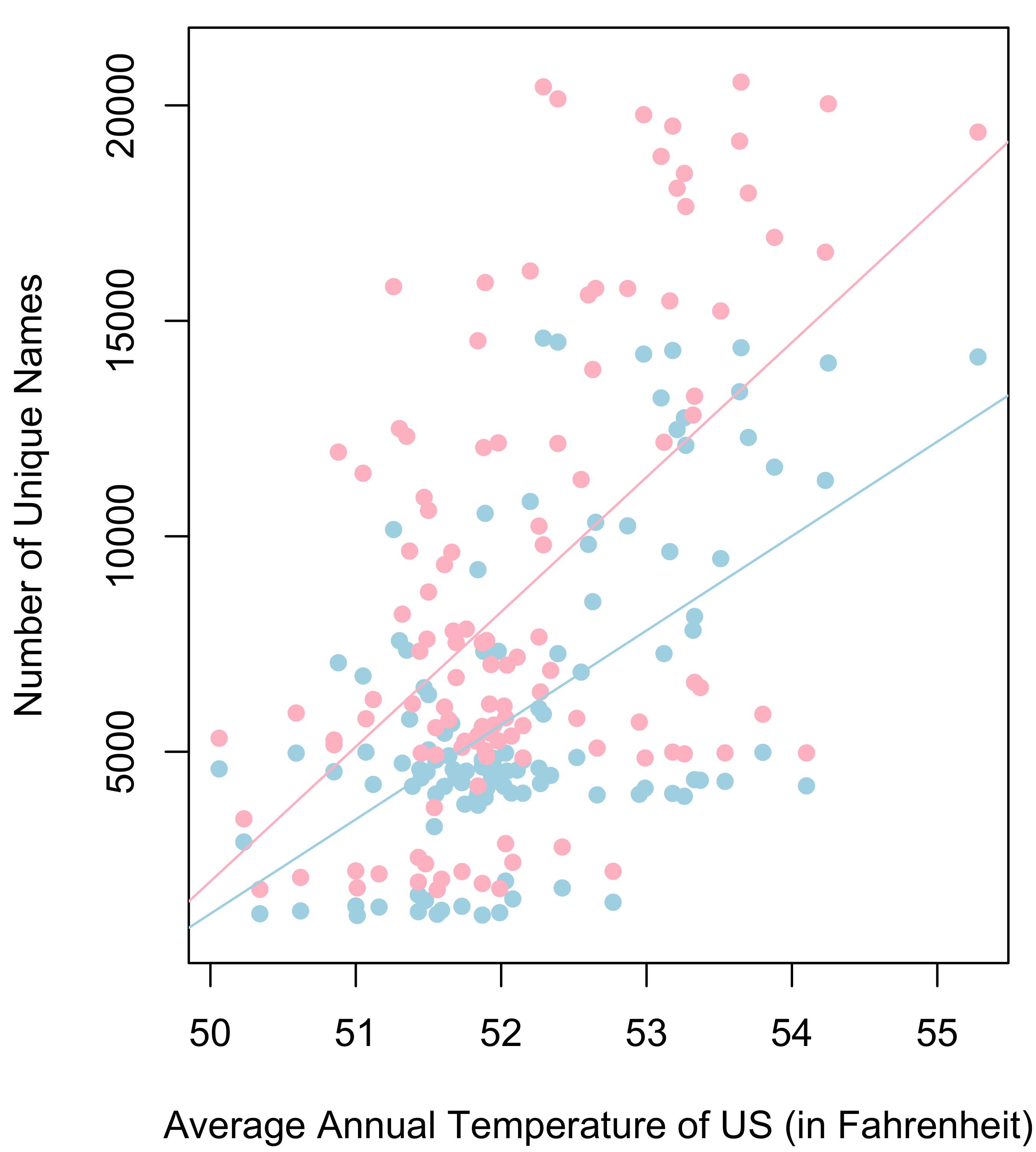
All of these explanations probably have some merit, but we would also like to mention that baby name diversity also seems to have risen with the increasing annual temperature of the US (i.e., climate change). In fact, there is a significant positive relationship between average annual temperature of the US (since 1895) and the number of unique male and female names[8]. In fact, for every increase in one degree Fahrenheit, there are 2,191 new male names and 3,127 new female names introduced in the US (Figure 2).
Its unknown why hotter temperatures are causing parents to go crazy with baby names[9], but as the US is expected to warm about 5º F this century, you can expect about another 10 to 15 thousand more baby names that are even dumber than Even, Ever, Zaydin, and Kyler.
References
Li W (2012) Analyses of baby name popularity distribution in U.S. for the last 131 years. Complexity 18:44-50.
Twenge J, Abebe EM, Campbell WK (2010) Fitting in or standing out: trends in American parents’ choices for children’s names, 1880-2007. Social Psychological & Personality Science 1:19-25.
Varnum MEW, Kitayama S (2010) What’s in a name? Popular names are less common on frontiers. Psychological Science 22:176-183.
Footnotes
[1] This is obviously not true. However, the rest of this article is based on real data, making it a true HARD article [Return to main text]
[2] That would be NAMES: A Journal of Onomastics, with onomastics meaning the study of proper names (and not the study of masturbation statistics). This journal launched in 1953 and has published such articles as: “Variation in automobile naming”, “Is 1069 a name?” and “The stuff of which names are made: a look at the colorful and eclectic namecraft of Lord Dunsany”. [Return to main text]
[3] Well, ok, this also not true, but this is really a continuation of the joke noted in the first footnote. Plus, we’re not even sure if the US does statutes (we’re also not sure what a statute is). [Return to main text]
[4] Our source here is a relative of one of the authors that will remain nameless. [Return to main text]
[5] Actually, in November 1936 they started requesting applications from postal workers. [Return to main text]
[6] US Statute 72-4224 also requires that in any graph made using baby names, all data concerning boys must be represented as light blue, and all data concerning girls must be represented as pink. [Return to main text]
[7] Note that there is a graph in this post that is extremely similar, if not identical, to our Figure 1 mid left panel. [Return to main text]
[8] P-values for both the male and female correlation are <0.001. R2 values are not given because they are very weak. [Return to main text]
[9] Although see here for an interesting hypotheses [Return to main text]

Proceedings of the Natural Institute of Science (PNIS) by https://instsci.org/ is licensed under a Creative Commons Attribution-ShareAlike 4.0 International License.